Stay up to date on the latest digital marketing topics.
News & Trends
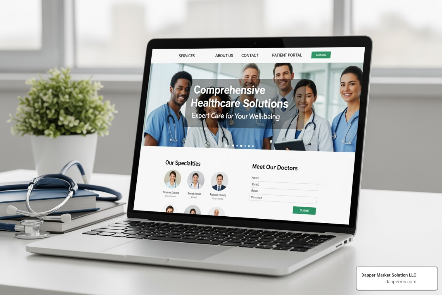
The Doctor’s Digital Dose: 15+ Modern Medical Website Designs You Need to See
Why Your Medical Website Is Your Most Powerful Marketing Tool
Medical website design examples show us what works when it comes to attracting and converting patients online. Here’s what the best healthcare websites have in common:
- Clean, accessible layouts that work perfectly on mobile devices
- Prominent online booking and clear calls-to-action
- Patient testimonials and real photos that build trust
- Fast load times and intuitive navigation
- Strong search functionality to help visitors find what they need quickly
In today’s digital-first world, your website isn’t just a brochure—it’s often the first interaction a potential patient has with your practice. And that first impression matters more than you might think.
Over 1 billion health-related searches happen on Google every day. That’s right—billion with a “b.” And here’s the kicker: 77% of patients begin their health journey on Google, researching symptoms, comparing providers, and reading reviews before they ever pick up the phone.
Yet despite this massive shift in patient behavior, many healthcare providers are still stuck with outdated websites that look like they were built in 2010. Slow loading times. Confusing navigation. No mobile optimization. The result? You’re losing patients to competitors before you even know they were looking.
A well-designed medical website does more than look good. It builds trust. It makes booking appointments effortless. It answers questions before patients have to ask. And perhaps most importantly, it shows you understand and care about the patient experience—because if you can’t get the website right, why should someone trust you with their health?
The good news? You don’t need a Fortune 500 budget to create an effective healthcare website. You just need to understand what works—and that’s exactly what we’re going to show you.
At Dapper Market Solutions, we’ve spent years helping healthcare practices transform their digital presence and fill their appointment calendars. Throughout this guide, we’ll walk you through medical website design examples that demonstrate exactly what modern patients expect and how you can deliver it.

Foundations of Effective Medical Website Design
Look, you can have the most talented doctors and state-of-the-art equipment in your practice, but if your website looks like it was built during the dial-up era, patients will never know. The foundation of great medical website design examples isn’t about flashy graphics or trendy animations—it’s about creating a digital space that patients can trust, steer easily, and use safely.
Think of your website as the digital equivalent of your waiting room. Would you want patients walking into a space that feels disorganized, confusing, or unsafe? Of course not. The same principle applies online.
Trust and credibility form the bedrock of everything else. When someone searches for a healthcare provider, they’re often anxious, uncertain, and looking for reassurance. Your website needs to answer that unspoken question: “Can I trust these people with my health?” A professional, well-organized site immediately signals competence and authority. One healthcare website study found that website design, clear layout, interactive features, and the authority of the owner all directly impact how much patients trust you. In other words, design isn’t just aesthetic—it’s functional trust-building.
User experience (UX) is simply about making your website easy and pleasant to use. Can patients find your phone number without hunting? Is it obvious how to book an appointment? Does the information flow logically? When UX is done right, patients don’t even notice it—they just feel satisfied. When it’s done poorly, they leave for your competitor’s site.
User interface (UI) is the visual partner to UX. This covers everything patients see and interact with—buttons, colors, fonts, spacing, layout. A clean, modern interface doesn’t just look professional; it makes the entire experience more intuitive. Think of UI as the paintwork and interior design of that waiting room we mentioned earlier.
Security and privacy aren’t optional extras in healthcare—they’re absolute requirements. Your website handles sensitive personal health information, which means you need rock-solid protections in place. This includes full compliance with HIPAA and HITECH regulations. We implement SSL certificates to encrypt data transmission, secure hosting environments, and multiple layers of protection to safeguard patient information. Without proper security measures, nothing else matters—you’re putting your patients and your practice at serious risk.
The Crucial Role of Accessibility (WCAG)
Here’s something many healthcare providers overlook: accessibility isn’t just about being nice or checking a compliance box. It’s about ensuring every potential patient can actually use your website, regardless of their abilities.
Consider this: About one in four adults in the United States lives with some form of disability. That’s a huge portion of your potential patient base. If your website isn’t accessible, you’re literally turning away patients who want your care.
Accessibility means designing with screen readers in mind—software that reads website content aloud for visually impaired users. It means ensuring complete keyboard navigation so people who can’t use a mouse can still access every feature. It involves using high-contrast design so text remains readable for those with low vision. And it requires proper alt text for images so screen readers can describe visual content to users who can’t see it.
The Web Content Accessibility Guidelines (WCAG) provide the roadmap for making all of this happen. These internationally recognized standards aren’t just technical requirements—they’re a framework for inclusive care that reaches every patient who needs you.
When we look at the best medical website design examples, accessibility isn’t an afterthought. It’s built into the foundation from day one. Because healthcare should be accessible to everyone, and that principle starts with your website.
15+ Inspiring Medical Website Design Examples
Now that we’ve covered the foundations, let’s look at real-world medical website design examples that bring these principles to life. These aren’t just pretty websites—they’re strategic tools that build trust, guide patients effortlessly, and make complex health information accessible.
Medical website design examples that build patient trust
When someone visits your website, they’re essentially asking: “Can I trust you with my health?” The best medical websites answer this question before it’s even asked.
Take Boston Children’s Hospital, for example. They’ve mastered something powerful: storytelling through patient testimonials.

When you’re a parent searching for specialized care for your child, anxiety runs high. Boston Children’s Hospital understands this deeply. Their website features inspiring stories of children who’ve undergone procedures and thrived afterward. These aren’t just testimonials—they’re narratives that create genuine human connection. You see real faces, read real stories, and suddenly this massive hospital feels personal and trustworthy.
Synergy Private Health takes a different but equally effective approach. Their homepage prominently features authentic photos of their actual doctors and patients—not the generic stock photos you see everywhere else. This matters more than you might think. Research shows people are naturally drawn to faces on webpages, and seeing real people makes the practice feel welcoming and approachable. It’s the difference between walking into a stranger’s office and being greeted by someone you feel like you already know.
Examples of Intuitive Navigation and User Flow
Here’s the thing about medical websites: patients rarely visit just to browse. They’re looking for something specific, often while feeling worried or pressed for time. The best medical website design examples make finding information effortless.

Mayo Clinic sets the gold standard here. Their website features a robust internal search function that goes far beyond a basic search bar. You can search alphabetically, browse by category, or dive into specific aspects like “Symptoms & Causes” or “Doctors & Departments.” When you’re dealing with thousands of conditions and hundreds of specialists, this level of search sophistication isn’t just helpful—it’s essential.
Cleveland Clinic takes a more direct approach. Right below their homepage tagline, you’ll find clear, prominent buttons for the three things most visitors need: finding doctors, getting directions, and booking appointments. No hunting through menus. No guessing where to click. Just simple, obvious paths to the information patients need most.
Then there’s HealthMatch, which demonstrates the power of a single-minded user journey. Their homepage is beautifully uncluttered, with one primary call-to-action: “Check your eligibility” for clinical trials. This laser focus prevents information overload and guides visitors directly to their goal. Sometimes the best design is the simplest one.
Designs That Excel at Communicating Information
Medical information can be dense, technical, and frankly intimidating. The challenge is making it understandable without dumbing it down or overwhelming people.

Healthline attracts almost 200 million visitors every month, and their success comes down to one thing: clarity. Their design features generous white space, a clean black-and-white color scheme, and content that breaks complex medical topics into digestible pieces. They use clear headings, helpful illustrations, and straightforward language that respects the reader’s intelligence without requiring a medical degree to understand.
MedLink Neurology faces a different challenge: organizing vast amounts of specialized neurological information. They solve this through exceptional information architecture, using color-coded categories that stay consistent across related pages. This creates a visual thread that helps visitors steer through complex academic content without getting lost. It’s proof that you can offer comprehensive, detailed information while maintaining a clean, organized design.
More medical website design examples for specific goals
Different practices serve different audiences, and smart design reflects that understanding.
Maven Clinic focuses on women’s and family health, and they’ve made a thoughtful design choice: an all-green color palette. This isn’t just about aesthetics. The color green can actually improve pain and anxiety, creating a calming atmosphere that aligns perfectly with their mission. Every design element reinforces their brand identity and speaks to their audience’s needs.
Rest Assured serves seniors and individuals with disabilities, making accessibility their north star. Their website meets WCAG 2.2 AA compliance standards with high-contrast fonts, keyboard navigation, large clickable buttons, and alt text on every image. This isn’t just checking boxes—it’s genuinely caring about reaching every patient who needs their services.
Finally, One Medical understands their audience: younger, digitally-savvy patients who value convenience. Their homepage promises a “new experience,” featuring diverse, modern imagery and emphasizing all-hours access to medical advice. With 43% of Millennials likely to switch practices in the coming years, One Medical speaks directly to what this generation values—and their design reflects it in every detail.
Key Features to Implement in Your Healthcare Website
Now that we’ve explored some outstanding medical website design examples, let’s talk about the specific features your practice needs to turn website visitors into actual patients.
Make it Easy for Patients to Take Action
Here’s the thing: your website isn’t a digital brochure that just sits there looking pretty. It’s a tool that should actively help patients connect with your practice. And yet, we see so many healthcare websites that make it surprisingly difficult for someone to actually do something.

Think about it from your patient’s perspective. They’ve found your website, read about your services, and they’re ready to take the next step. What happens next should be obvious and effortless.
Clear calls-to-action (CTAs) are your best friend here. Buttons like “Schedule an Appointment,” “Find a Doctor,” or “Contact Us” need to stand out visually and be strategically placed where patients naturally look. We’re talking about prominent placement, contrasting colors, and language that tells patients exactly what will happen when they click.
Online appointment scheduling has become table stakes in healthcare. Here’s a number that should get your attention: 67% of patients prefer online booking because they can do it on their own schedule—no phone tag, no waiting on hold during business hours. Brightside Health does this brilliantly with their “Start With A Free Assessment” button that guides visitors through a simple, friendly booking process. When we implement these systems for our clients, we consistently see a spike in appointment bookings and a reduction in administrative phone calls.
For mobile visitors (which, let’s be honest, is most people these days), click-to-call phone numbers are essential. One tap and they’re connected to your office. No copying and pasting numbers or switching apps.
And don’t forget about your existing patients. Easy access to your patient portal for medical records, prescription refills, and secure messaging shows you respect their time and value their ongoing relationship with your practice.
Prioritize Mobile-First Design and Performance
Let me share something that might surprise you: 55% of all website traffic comes from mobile phones, and 92.3% of internet users access the internet on their mobile devices. If your website doesn’t work beautifully on a smartphone, you’re essentially turning away more than half of your potential patients.
At Dapper Marketing Solutions, we design with a mobile-first approach. This means we start by creating the perfect experience for small screens, then expand from there. It’s not about shrinking down a desktop site—it’s about reimagining the entire experience for how people actually use their phones.
Mobile responsiveness means your website automatically adjusts to look and function perfectly on any device—whether someone’s browsing on an iPhone, an Android tablet, or a desktop computer. Forms should be easy to fill out with your thumbs. Buttons should be large enough to tap without accidentally hitting the wrong thing. Text should be readable without zooming in.
But here’s where things get really important: fast load times aren’t just nice to have—they directly impact whether patients stick around. A slow website is frustrating, and frustrated visitors leave. They also leave for your competitors. Google knows this, which is why page speed is a ranking factor. In fact, Google’s mobile-first indexing means the search giant primarily uses your mobile site’s performance to determine your search rankings.
We’ve seen this play out beautifully with organizations like The Linked Immunisation Action Network. They prioritized high performance and lightning-fast loading times, ensuring their vital health information reaches people even in areas with limited internet connectivity. That’s the kind of thoughtful design that makes a real difference.
Simplified mobile navigation is another crucial element. Complex dropdown menus that work great on desktop can be nightmares on mobile. We design navigation that’s clean, intuitive, and thumb-friendly—because that’s how people actually interact with their phones.
Balance Information with a Clean, Uncluttered Layout
Healthcare is complex. Your website doesn’t have to be.
A challenge in medical web design is conveying comprehensive information without overwhelming visitors. We’ve all seen those websites that feel like someone dumped an encyclopedia onto the screen. Dense paragraphs. Tiny text. Everything competing for attention. It’s exhausting.
The solution? Strategic visual hierarchy that guides patients naturally through your content. We use headings, subheadings, and bold text to create a clear structure that helps visitors quickly find what they need. Think of it as creating a clear path through your information, rather than dropping patients in the middle of a maze.
White space is your friend. It’s not wasted space—it’s breathing room that makes your content more readable and your design feel modern and professional. When we look at exceptional medical website design examples like athenahealth, we see how effective use of white space, combined with simple navigation and clear CTAs, creates a website that feels approachable rather than overwhelming.
High-quality imagery and engaging video break up text and communicate complex ideas quickly. But here’s the key: use authentic photos of your actual practice and staff, not generic stock images. Mayo Clinic does this masterfully, incorporating bold video content right in their homepage header to immediately engage visitors and convey their expertise.
We also recommend breaking up text into digestible chunks. Short paragraphs, bullet points when appropriate, and numbered lists make information easier to scan and absorb. Most people don’t read websites word-for-word—they scan for the information they need.
Simple navigation ties it all together. When someone visits your site, they shouldn’t need a roadmap to find basic information. Keep your primary navigation clean and limited to the most important sections. Secondary information can live in footer menus or within relevant pages. The goal is to help patients find what they need in two or three clicks, not send them on a scavenger hunt.
At the end of the day, balancing comprehensive information with a clean design isn’t about dumbing down your content—it’s about respecting your patients’ time and making healthcare information accessible to everyone.
Frequently Asked Questions about Medical Website Design
When we talk with healthcare providers about medical website design examples and what makes them work, we hear the same questions come up again and again. Let’s tackle the big ones:
How much does a medical website cost?
I’ll be honest with you—this is like asking “how much does a car cost?” The answer depends on what you need it to do.
A basic informational website using a pre-made template might run you a few thousand dollars. But if you want a fully custom design with integrated patient portals, online scheduling, telemedicine capabilities, or extensive content libraries, you’re looking at a significantly higher investment—potentially tens of thousands of dollars.
Here’s what typically drives the cost up or down. Custom design costs more than adapting a template, but you get unique branding that sets you apart. The features you include make a huge difference—think appointment booking systems, patient portals, and secure messaging. Working with an agency like Dapper Marketing Solutions typically costs more than hiring a freelancer, but you get a complete team of specialists covering design, development, SEO, and ongoing support.
Don’t forget about ongoing maintenance either. You’ll need to budget for hosting, security updates, software licenses, and keeping your content fresh and accurate.
But here’s the thing we always emphasize: a well-designed medical website isn’t just an expense—it’s an investment. When patients can easily find you, book appointments online, and trust your practice before they even walk in the door, that website pays for itself through increased patient acquisition and improved efficiency.
What is the most important element of a medical website?
This is a bit of a trick question, because honestly? There isn’t just one magic element.
If we absolutely had to pick, we’d say patient trust sits at the heart of everything. But trust doesn’t come from a single feature—it’s built through the combination of several crucial elements working together.
Easy navigation matters because patients often visit your site when they’re anxious or unwell. They need to find information quickly without frustration. Clear contact information—prominently displayed phone numbers, addresses, and online forms—shows you’re accessible and ready to help. Mobile-friendliness is non-negotiable since most patients will view your site on their phones. And a professional appearance with a clean, modern design instills confidence that you’ll provide the same level of care to their health.
Think of your website like your practice itself. Would you trust a doctor’s office that was hard to find, had confusing signage, and looked outdated? Probably not. The same principle applies online. It’s the synergy of all these components, working together and focused on the patient experience, that makes a medical website truly effective.
How do I ensure my website is HIPAA compliant?
This is where a lot of healthcare providers get nervous—and rightfully so. HIPAA and HITECH regulations are serious business, and non-compliance can lead to hefty fines.
The good news? When you work with experienced professionals who understand healthcare, HIPAA compliance becomes part of your website’s foundation, not an afterthought.
Secure hosting is your first line of defense. We only use hosting providers that meet HIPAA’s stringent security requirements. Every site we build includes an SSL certificate, which encrypts data traveling between your patient’s browser and your website—think of it as a secure tunnel for sensitive information.
Any forms where patients submit personal or health information must use encrypted transmission. If you’re using third-party tools like scheduling software or patient portals, those vendors need to sign Business Associate Agreements (BAAs), committing themselves to HIPAA compliance just like you do.
We also carefully review all content to make sure no protected health information (PHI) appears on public pages where it shouldn’t be. And because navigating HIPAA can get complex quickly, we work closely with legal and compliance experts to ensure your website meets all necessary regulations.
Here’s what it comes down to: you shouldn’t have to become a HIPAA expert to have a great website. That’s why partnering with an agency that specializes in healthcare makes such a difference. We handle the technical compliance details so you can focus on what you do best—caring for patients.
Build a Patient-Centric Website That Grows Your Practice
We’ve explored some truly outstanding medical website design examples throughout this guide, and I hope you’ve seen a common thread running through all of them: they put patients first. These aren’t just pretty websites—they’re carefully crafted digital experiences that build trust, provide accessibility, guide visitors smoothly through clear navigation, and work beautifully on every device.
Your website is working 24/7 for your practice, even when your doors are closed. It’s answering questions at midnight, building confidence with anxious parents researching pediatricians, and helping busy professionals book appointments during their lunch break. When done right, it becomes one of your most valuable team members.
The healthcare landscape is constantly evolving, and patient expectations are rising right along with it. The websites that succeed are the ones that adapt and grow with these changing needs—sites that understand today’s patients want convenience, transparency, and a seamless digital experience that mirrors the quality of care they’ll receive in person.
At Dapper Marketing Solutions, we’ve spent years helping healthcare providers create websites that do exactly this. We work with practices in South Lyon, Michigan, Redford, Oklahoma City, and beyond, and we’ve seen how the right website can transform a practice’s ability to connect with patients and grow.
Here’s what makes us different: we don’t just understand web design—we understand healthcare. We know the regulations you need to follow, the trust you need to build, and the unique challenges you face in communicating with patients online. We’re passionate about creating digital solutions that feel as caring and professional as the service you provide every day.
If you’re ready to stop losing patients to outdated web design and start attracting the people who need your care most, we’d love to help you build something exceptional.
Get a custom healthcare website design that attracts and retains patients.
Explore More From DMS


The Team, The Team, The Team!