
Beyond the Waiting Room: A Deep Dive into the Top 10 Healthcare Websites of 2025
Why Healthcare Websites Are Your Most Important Marketing Asset
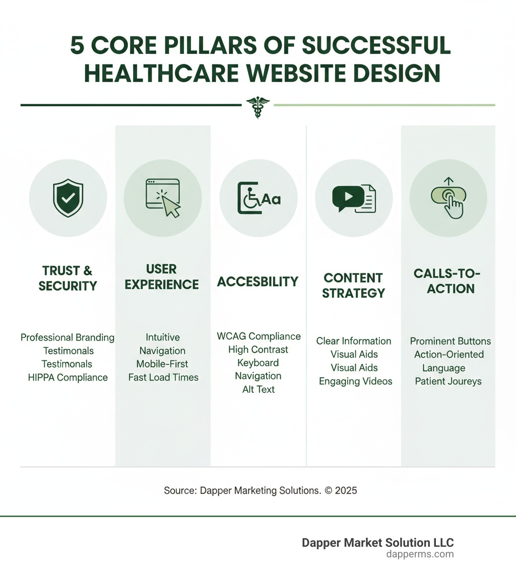
Best healthcare website designs combine trust, clarity, and accessibility to turn anxious visitors into confident patients. Here’s what makes them work:
- Trust signals: Professional branding, physician bios, patient testimonials, and visible security badges
- Exceptional UX: Intuitive navigation, robust search, and mobile-first design
- Accessibility: ADA compliance with WCAG standards, high-contrast colors, and keyboard navigation
- Clear content: Plain language, visual aids, and organized health information
- Strong CTAs: Prominent buttons for appointments, finding doctors, and patient portals
- Security: HIPAA compliance, SSL certificates, and transparent privacy policies
The stakes are high. Nearly 80% of all internet users have searched for medical and health information online. Even more telling: 77% of patients begin their health journey on Google. That means your website is often the first—and sometimes only—chance to make a lasting impression.
The problem? Most healthcare websites fail to meet expectations. Research shows 90% of prospects report a poor customer experience, and 63% will abandon a brand over it. With only 8 seconds to make an impression, every design choice matters.
The best healthcare websites don’t just look professional—they make patients feel safe, informed, and ready to take action. They balance comprehensive information with clean design and guide users to the right care path without overwhelming them. And they work flawlessly on mobile devices, where 70% of healthcare website visits now happen.
I’m Deepak Dashairya. I’ve spent years helping healthcare organizations transform their digital presence. By analyzing the best healthcare website designs, I’ve seen how trust, clarity, and accessibility can fill waiting rooms and build lasting patient relationships.
The Anatomy of a Winning Healthcare Website
Your healthcare website is the digital front door to your practice. Patients form opinions about your care quality based on your site before they ever step into your office. Your digital presence must be as thoughtfully designed as your physical one.
The best healthcare website designs aren’t built on aesthetics alone. They’re crafted around what matters to anxious, information-seeking visitors: Can I trust this provider? Will I find what I need quickly? Is my personal information safe here?
Trust signals form the foundation. When visitors land on your site, they’re looking for reassurance. Professional branding, detailed physician bios, authentic patient testimonials, and visible security badges all work to answer the unspoken question: “Should I trust my health to these people?”
User Experience (UX) is the invisible architecture that makes a site feel effortless. It anticipates questions and guides users to answers, so a worried person at 2 AM isn’t hunting through confusing menus.
Here’s something that can’t be ignored: 70% of healthcare website visits now happen on mobile devices. That means your mobile-first design isn’t optional—it’s essential. Your site must work flawlessly on a smartphone or a desktop computer.
Finally, ADA compliance and HIPAA security are promises to your patients: that everyone can access your services and their private data is safe. Clean design, simple navigation, and fast load times ensure finding information is easy, not a scavenger hunt. The Web Content Accessibility Guidelines (WCAG) provide the roadmap for true accessibility.
Building Trust and Ensuring Security
In healthcare, trust is everything. A patient might forgive an outdated waiting room, but not a sketchy website. Your online presence is where relationships begin, and first impressions are critical.
Building trust starts with cohesive professional branding. Your visual identity, messaging, and mission should feel consistent, showing you’re a well-run organization.
Authenticity moves the needle. Physician bios should show personality, not just credentials, to help patients connect. Human touches like hobbies or family life matter more than you’d think.
Patient testimonials provide proof that real people got real help. Reading about another patient’s successful journey transforms your services from abstract promises into tangible outcomes. Just be sure to get proper consent.
Security deserves prominent placement. SSL certificates encrypt communication, and visible security badges offer reassurance. Your HIPAA compliance notices and privacy policies must be easy to find and written in plain English. Since HIPAA legally requires encryption for U.S. providers, making your security measures visible shows patients you take their privacy seriously.
Mastering User Experience (UX) and Accessibility
The best UX is unnoticeable—it just works. Intuitive navigation lets a worried parent find urgent care info in seconds. A robust search functionality helps users find specific services without navigating endless menus.
Mobile responsiveness is absolutely essential. With 92.3% of internet users accessing the internet on mobile phones and 55% of all website traffic coming from mobile devices, your site must function beautifully on all screen sizes. An appointment scheduler that breaks on mobile turns patients away.
Accessibility means designing for everyone. Following WCAG 2.2 AA standards ensures visitors with disabilities can access your services. This includes large, readable fonts, high-contrast colors, and keyboard navigation. Every image needs alt text so screen readers can describe it, and videos should have captions.
Other essential accessibility features include clear focus indicators, adjustable text sizes, predictable navigation, helpful form error messages, and large, tappable buttons. These aren’t just technical requirements; they’re about respect. An accessible site tells every potential patient they matter.
A Showcase of the Best Healthcare Website Designs
I’ve spent years studying what makes a healthcare website exceptional. It’s not just professionalism; it’s creating experiences that make anxious patients feel understood and confident. Here are some standout examples that get it right.
These sites show what’s possible when design meets patient care. I’ve organized them by their strongest qualities to show how different approaches solve challenges. The examples are based on real-world leaders, focusing on design principles you can apply.
Category 1: Excellence in Simplicity and Clarity
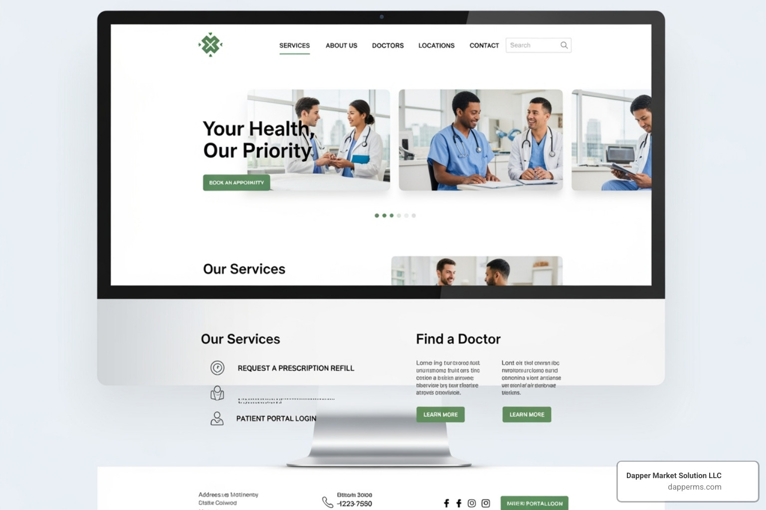
A simple website is reassuring. When worried about health, visual chaos is the last thing a visitor needs. The best healthcare website designs in this category know simplicity is about respecting a patient’s mental state.
Example 1: A Health-Tech Platform with Minimal Navigation and Clear Value Proposition
This health-tech company explains complex services simply. Its homepage has minimal navigation, using crisp animated messaging instead. The uncluttered layout and simple, calming color palette help users understand their offer in seconds. This focused approach is ideal for B2B audiences needing quick answers.
Example 2: A Specialized Surgical Hospital with a Clean, Black-and-White Design and a Single, Prominent CTA
Bold choices can create clarity. This surgical hospital uses a striking black-and-white aesthetic, punctuated with a brand color for interactive elements. Nothing competes for attention except what matters. The “Request an Appointment” button stands out due to thoughtful restraint elsewhere. Clear typography and white space make every word count.
Category 2: Mastery of Content and Information Delivery
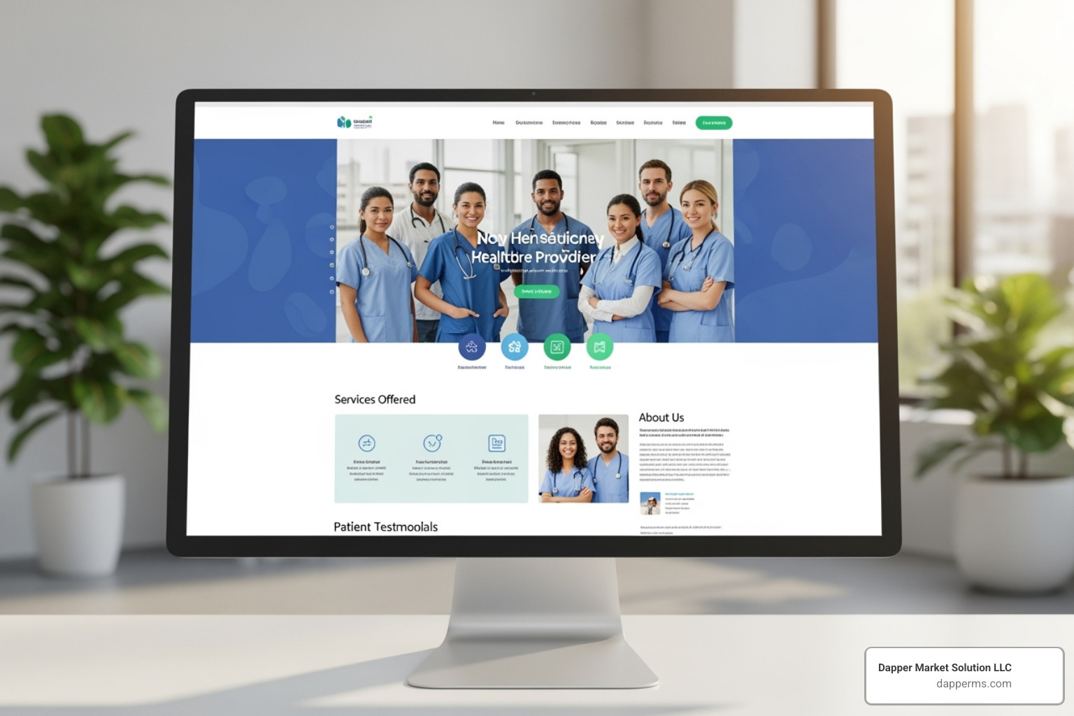
Medical information is often overwhelming. These sites make vast amounts of information useful through robust health libraries, engaging blog content, and thoughtful organization.
Example 3: A Leading Academic Medical Center with a Powerful Site Search and A-Z Condition Index
This academic medical center has a powerful search tool. Its prominent search bar uses autocomplete to suggest conditions, treatments, and services. An A-Z index helps users who are unsure of spelling. It’s a masterclass in information architecture that respects how people search for health information.
Example 4: A Health Information Site Known for Its Medically Reviewed, Easy-to-Understand Articles
This health information site delivers accurate, easy-to-understand medical information. Its clean layout, white space, and effective color palette make complex articles approachable. Medically reviewed articles are written in plain language, balancing comprehensive detail with clarity. Multimedia and engaging blog content make health topics interesting.
Example 5: A Regional Health System Using Patient Story Videos and Facility Tours
Video execution is key. This regional health system gives users control, with no auto-playing videos. Instead, it offers on-demand facility tours, provider interviews, and patient stories. This video storytelling creates emotional connections, humanizes treatments, and makes medical environments feel welcoming, recognizing that people need different types of reassurance.
Category 3: Innovating with User-Centric Features
Innovation in healthcare web design means understanding user needs. These sites excel with interactive tools, seamless appointment scheduling, intuitive patient portals, and personalized user journeys.
Example 6: A Women’s Health Company with a Guided User Journey Based on Life Stage
This women’s health platform understands that needs change based on life stage. It organizes information by stages like conception, pregnancy, and parenting, using a supportive color scheme. Interactive questionnaires personalize the experience, guiding users to relevant resources. It’s like having a knowledgeable friend guiding you.
Example 7: A Clinical Trial Matching Service with a Single-Minded “Check Eligibility” User Flow
This site simplifies clinical trial matching with a laser-focused design. The uncluttered homepage features one dominant call-to-action: “Check Your Eligibility.” This focused messaging eliminates decision paralysis and guides patients to their goal. It’s a brilliant example of user-centric design.
Category 4: Standout Visuals and Branding
We connect with providers emotionally. These sites use high-quality original photography, custom illustrations, and cohesive branding to create trust and connection in a way stock photos cannot.
Example 8: A Virtual Clinic Using Warm, Original Photography to Build Trust
This virtual clinic uses original photography that matches its pleasant color scheme. Instead of generic stock photos, they feature authentic images of real practitioners in natural settings, conveying professionalism and approachability. The warm tones and genuine smiles build trust, which is crucial for a digital-only service.
Example 9: A Mental Health Platform with Unique, Friendly Illustrations to Destigmatize Care
This mental health platform tackles stigma with friendly, custom illustrations. The distinctive line drawings create a relaxed, welcoming mood, making emotional topics more approachable than a clinical design would. This consistent visual language reinforces their brand and makes users feel safe.
Example 10: A Fertility Clinic with a Striking Color Scheme and Modern Aesthetic
This fertility clinic’s design is both beautiful and functional. A striking color palette creates a memorable brand identity. Minimalist, lazy-loaded animations add polish without hurting performance. Original photography and clean icons guide users through services toward clear calls to action. It’s a great example of how cohesive branding can make a sensitive topic feel more hopeful.
From Information to Action: Crafting Effective User Journeys
A beautiful website is useless if visitors get lost. The best healthcare website designs don’t just inform; they guide users from an anxious search to booking an appointment.
At Dapper Marketing Solutions, we develop user personas to map patient needs. A parent searching for a pediatrician at 2 AM has different needs than someone researching a chronic condition. We design for both, ensuring every interaction is supportive.
The challenge is balancing information with a clean design. Worried patients won’t read walls of text. We’ve seen sites use color-coded tiles for visual continuity and organization. The key is anticipating patient needs and removing obstacles.
Visitors might be scared, confused, or in pain. They need clear pathways, not puzzles. This is where navigation best practices and effective Calls-to-Action (CTAs) become powerful tools for converting visitors into patients.
Designing Intuitive Navigation and Powerful CTAs
Navigation is your website’s roadmap, and it must be crystal clear. Patients don’t have time for confusing menus when their health is on the line.
Mega menus work well for larger organizations, organizing extensive information without clutter.
Sticky navigation keeps the navigation bar visible as users scroll, which is especially valuable on mobile, where 70% of healthcare website visits happen.
A prominent search bar is essential. With 7% of Google’s daily searches being health-related, people expect to search. A robust search function with autocomplete empowers users to find what they need quickly.
Your CTAs are critical. The right wording can mean the difference between a bounce and a booked patient. We use action-oriented language to make the next step obvious and distinguish between primary and secondary CTAs so the main action stands out.
Here are the CTAs we’ve found most effective for healthcare websites: “Find a Doctor,” “Schedule an Appointment,” “Access Patient Portal,” and “Get Care Now.” Other high-performing options include “Request a Consultation,” “View Services,” “Learn More About [Condition],” “Contact Us,” “Register for an Event,” and “Pay Your Bill Online.”
Placement matters. Your primary CTA should be above the fold, repeated at key decision points, and always be easy to spot on mobile.
Tailoring Designs for B2C Patients vs. B2B Partners
Not all healthcare websites serve the same audience. We’ve worked with both B2C and B2B healthcare companies, and the design approach must shift for each.
For B2C patients, empathy is key. The design should be welcoming, using patient-centric language. The focus is on immediate benefits like booking appointments, finding locations, and understanding what to expect.
For B2B partners, the conversation shifts to expertise, outcomes, and ROI. The language is more professional, highlighting efficiency and business impact. Case studies for B2B are critical for demonstrating how your solutions help similar organizations.
Smart sites use clear audience segmentation on the homepage, such as “For Patients” and “For Providers” sections. This routes users to relevant content, preventing confusion and ensuring each group finds what they need.
The visual design often differs, too. Patient-facing sites might use warmer colors and more photos of people, while B2B platforms lean toward data visualizations and professional imagery. Both can be among the best healthcare website designs—they’re just designed for different journeys.
Frequently Asked Questions about the Best Healthcare Website Designs
When healthcare providers come to us looking to improve their digital presence, they often ask the same thoughtful questions. Let’s address the ones we hear most often.
How important is high-quality imagery and video in healthcare website design?
Visuals can make or break your healthcare website. They’re not just decoration—they’re trust-builders.
From a patient’s perspective, visiting your site can be an anxious experience. High-quality original photography of your staff and facilities makes your practice feel real and approachable, unlike stock photos. Seeing friendly faces and clean spaces helps reduce anxiety.
Video takes this connection further. Video testimonials from real patients are more powerful than any marketing copy. Giving users control over video content like facility tours respects them and builds trust. Video is also significantly more engaging than images, creating empathy.
Videos also excel at explaining complex procedures without being overwhelming. An animation can clarify a surgical procedure in ways text cannot, and facility tours help patients feel comfortable before they arrive.
Authenticity is key. Patients spot generic stock photos easily. Original photography and video humanize care and create emotional connections that convert anxious visitors into confident patients.
How can a website deliver complex medical information without overwhelming users?
This is a major challenge in healthcare web design. Medical information is complex, but your website doesn’t have to be.
Start with plain language. Medical jargon alienates patients. If technical terms are necessary, explain them simply. The goal is to inform, not impress.
Visual aids are your best friend. Infographics and diagrams can explain concepts in seconds. A picture is worth a thousand words, especially when explaining the human body.
Use accordion or toggle features for layered information. Users see the basics first and can expand for more detail. This keeps the view clean while providing depth.
We also believe in breaking content into digestible chunks. Short paragraphs, white space, and clear headings guide users through the content, letting them scan for what’s important.
Robust search and filtering options are essential for large medical libraries. A powerful search function empowers users to find exactly what they need, when they need it.
The bottom line: Complex information doesn’t require a complex presentation. Thoughtful design can make technical content feel accessible and reassuring.
What are the key differences between designing for a hospital versus a private practice?
While core principles apply to both, the scale and approach differ.
A hospital website is like a small city, with a vast scope of services and multiple locations. It must serve multiple user journeys: patients, researchers, donors, job seekers, and campus visitors. This complexity requires intricate navigation and segmentation, including robust directories and location finders. The brand must balance authority and compassion. Larger budgets often allow for more advanced features.
A private practice website is more like a welcoming home. The focus is narrower, on specific specialties or a single physician. The primary audience is patients, making the user journey straightforward. The brand can be more personal, centered on the physician’s expertise. With more constrained resources, design choices must be efficient. Simple contact information and appointment scheduling are priorities.
For example, a large institution must balance extensive services for diverse audiences. A private practice has a more direct focus: making contact and appointment info easy to access. Both can be among the best healthcare website designs by catering to their unique audiences.
Transform Your Digital Front Door
Your website isn’t just a digital brochure—it’s often the first conversation you have with a future patient. In healthcare, that first impression can mean everything.
We’ve explored what makes a healthcare website exceptional. The best healthcare website designs are built on five pillars: trust signals, exceptional user experience, accessibility, clear content, and strong calls-to-action.
Winning sites are mobile-first, HIPAA-compliant, fast, and intuitive. They look professional without feeling cold. Most importantly, they remember that behind every click is a person deserving of respect and clarity.
The future of healthcare design will evolve, but patient-centricity remains the north star. Technology will advance, but the human element—empathy, understanding, and reassurance—will always matter most.
At Dapper Marketing Solutions, we help healthcare organizations transform their digital presence. We serve practices in South Lyon, Redford, Oklahoma City, Downham Market, and beyond, using custom strategies, SEO, and thoughtful design to connect them with patients.
Your website should work as hard as you do. It should answer questions 24/7, make scheduling simple, and build trust before the first handshake.
Ready to build one of the best healthcare website designs? Let’s create a digital front door that feels welcoming, works flawlessly, and turns worried visitors into confident, loyal patients. Explore our healthcare web design and development services and let’s talk about turning your online presence into your most powerful patient acquisition tool.


